"TPS" can refer to a "Testing Procedure Specification," which is a very tedious set of documentation created and defined by the Institute of Electrical and Electronics Engineers (IEEE). (Its document number is IEEE 829.)

A very tedious set of documentation popularized by our friend Lumbergh who delighted in engaging his minions with mundane busy work. The ironic beauty of this Office Space scene is that we all can relate. How many times have we been asked to produce something that we all know provides absolutely no value, and how much energy do we waste in doing so?
Providing Answers
One of the key objectives for DataGravity is utilizing data to provide answers. Not answers to complete our own version of a TPS report, but answers to practical questions. Answers that can be surfaced quickly, allowing us to focus on making decisions rather then on the tedious task of compiling data. Answers that can be articulated through consumable visual representations. Answers that are relevant by bringing together people and the content they produce over time. My goal as part of the last series of posts is to shed some light on how DataGravity can provide these answers.
Simple Reporting
It is often the little things that I tend to appreciate the most, and so let's look at couple of most simple yet impactful reports DataGravity provides to assist us in finding answers.
Dashboard
Using this view, which is simply one click on the interface, I can very quickly identify key metrics on my data usage across the entire system. I can see things like average and total file counts in sum or broken out across shares and VMs. I can quickly determine how much space has been allocated and how much is being used, along with the savings I am realizing from data reduction. I have visibility into the number of items I am protecting on the system that could be recovered if called upon.

System Overview/Management
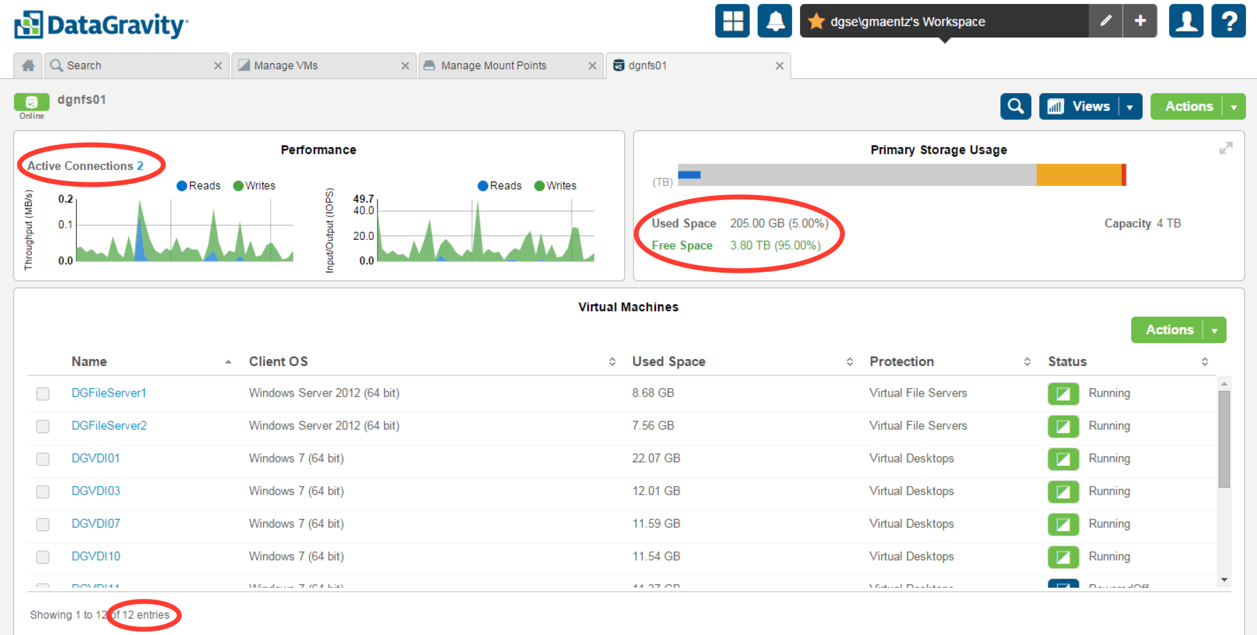
The DataGravity System Management reporting interface provides all the information I have come to expect from a storage platform, arranged and organized in a very logical way. With a focus on simplicity, it is easy to identify the overall health of the system: component health, alerts, real-time performance information. It is easy to see the total number of active connections on a per share basis, broken down by protocol. Disk utilization and capacity. Each of these tiles can then be expanded if necessary to provide the next level of detail for a particular item.

VM Datastore
Looking at a VM datastore presented by DataGravity provides a simple, consumable way for me to understand more about the datastore and what is is hosting. I can see real time performance of the datastore, how many connections it has to it, used/free space. It is easy to see the total number of VMs, their current status and detail. I have the ability to then drill into each VM individually if I wish to understand in more detail about its performance and activity.
KISS
Sure, I could probably spend time writing some scripts and gathering all of this information in other ways. I could probably comb through a series of different interfaces, and start collecting data. Those methods start to give me that TPS report feeling of tedious, complex busy work. It is the simplicity of the DataGravity interface that I have come to appreciate.